
Overview
Our company’s official name is D2L. To respect the way that many people know us, we also answer to Desire2Learn. It’s like a person who’s known as Jim but answers to James in certain situations.
Preferred logo
When referencing our company, use the preferred D2L logo.
Recognizable and clear
The primary logo underlines the 2 as the feature, it’s raised 2 represents growth, and we underscore it to highlight our focus on partnerships. Our logo is above all legible and recognizable, and should be shown intact and unaltered whenever possible. An inverted version is offered below for specific circumstances.
Download logo
Print: .eps
Screen (transparent): .png
Screen (solid background): .jpg
Clearspace
The stacked format of the D2L logo is the core of our identity’s design system. It’s best used when given breathing room—as either a focus or sign-off—and should always be displayed with the component elements’ proportions and arrangement intact. Logo clearspace should be approximately the same height as three stacked underlines from under the number 2 in “D2L”.
Minimum size
To maintain clarity and legibility, the logo should maintain a minimum size of 80px wide.
Additional uses
There are other logo treatments that can be used when used on a coloured background, or printing limitations.
Knockout
A knockout of the logo is primarily used on a coloured background, but it can also be used on an image background if the background is clean and relatively solid in colour. It can also be used on backgrounds where the green underline isn’t visible, or is hard to distinguish.
Download logo
Greyscale
In some cases a single colour version must be used because of printing limitations, in which case a greyscale version of the logo can be provided.
Download logo
Print: .eps
D2L Logo colours
Green
PMS 805C
CMYK: 65 0 100 0
RGB: 52 232 42
HEX: #34E82A
Rich Black
PMS NA
CMYK: 60 40 40 100
RGB: 0 0 0
HEX: #000000
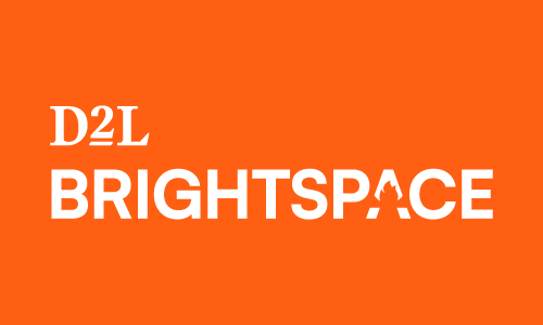
When referencing D2L Brightspace
If you are referring to the Brightspace Learning Platform, you can choose to display the D2L Brightspace logo instead of the D2L logo. This entire experience should reflect the D2L Brightspace colour scheme.
D2L Brightspace
The simplicity of the logos ensures that our touchpoints express quality and confidence. This simplicity enables the flexibility we need to speak with our diverse audiences, but always authentic, friendly, and straight-forward tone.
Download logo
Print: .eps
Screen (Transparent): .png
Screen (solid Background): .jpg
Additional uses
There are other logo treatments that can be used when used on a coloured background, or printing limitations.
Knockout
A knockout of the logo is primarily used on a coloured background, but it can also be used on an image background if the background is clean and relatively solid in colour. It can also be used on backgrounds where the green underline isn’t visible, or is hard to distinguish.
Download logo
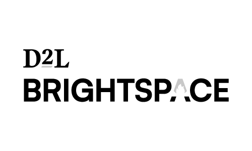
Greyscale
In some cases a single colour version must be used because of printing limitations, in which case a greyscale version of the logo can be provided.
Download logo
Print: .eps
D2L Brightspace Logo colours
Orange
PMS 1575C
CMYK: 0 62 86 0
RGB: 255 129 44
HEX: #FF812C
Rich Black
PMS NA
CMYK: 60 40 40 100
RGB: 0 0 0
HEX: #000000
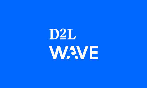
When referencing D2L Wave
If you are referring to the D2L Wave Platform, you can choose to display the D2L Wave logo instead of the D2L logo. This entire experience should reflect the D2L Wave colour scheme.
D2L Wave
The simplicity of the logos ensures that our touchpoints express quality and confidence. This simplicity enables the flexibility we need to speak with our diverse audiences, but always authentic, friendly, and straight-forward tone.
Download logo
Print: .eps
Screen (transparent): .png
Screen (solid background): .jpg
Additional uses
There are other logo treatments that can be used when used on a coloured background, or printing limitations.
Knockout
A knockout of the logo is primarily used on a coloured background, but it can also be used on an image background if the background is clean and relatively solid in colour. It can also be used on backgrounds where the green underline isn’t visible, or is hard to distinguish.
Download logo
Greyscale
In some cases a single colour version must be used because of printing limitations, in which case a greyscale version of the logo can be provided.
Download logo
Print: .eps
Logo colours
Blue
PMS 2995C
CMYK: 81 12 1 0
RGB: 6 166 255
HEX: #06A6FF
Rich Black
PMS NA
CMYK: 60 40 40 100
RGB: 0 0 0
HEX: #000000
Print vs. screen format
Print (.eps)
Print files use the CMYK or Pantone colour mode shown below. These files are suitable when providing the logo to professional printers. These files remain crisp and sharp, at any scale. Not everyone has the correct programs to open or view .eps files. Although most if not all professional printers will be able to open an eps.
Screen (.png)
Screen files use the RGB and Hex colour modes shown below. These files are suitable for anything you view on a screen. You can us them in programs such as Microsoft Word, or Powerpoint. PNG files will not reproduce well when enlarged. We have provided PNGs at a large size that you can reduce. This ensures the best possible looking logo for your needs.